Tuesday, 9 July 2013

Final Assignment-How Technology Affect Human

Final Assignment-How Technology Affect Human

Summary:

Nowadays, technology has affected a lot of thing in our life. Now technology more advanced cause people can't without technology a day. So most of the thing what we done are depends on technology. I've done my research about how technology affect our life by Internet and some books. After my research, i found that the development and improvement of technology has greatly improved our lives. It has led to a far better, easier and very comfortable life for the peopleThe rise of the internet technology has improved our daily lives in very many ways. The world business and trade has become very fast, easier and more reliable. We can now transact business with a person who is very far from us without any difficulties.The payment of bills and other accounts related jobs of every business is easily managed by the available online facilities at the comforts of our home without having to move. Financial institutions and banks have introduced online internet systems which makes life easier. The introduction of ATM has made it very possible to withdraw money at anytime of the day.Banks and other financial institutions are now filling data in the computer instead of doing it manually as they used to do in the old days.This makes it easier to fine the name of the customer, address, email address, birth date, phone numbers and even the location. Also the clients can get a very quick access at their account balances by logging in to the bank website.With the rise of computer technology, credit cards and other plastic money which are very useful especially when one do not have cash at hand or when one is ordering online products and or services have manufactured.Communication has been made easier for example the internet has brought email and chatting facilities. Instead of sending letters to respective destinations, it is very easy to send an email which will be received instantly.

Sketch:


Step by step process:

Step 1:
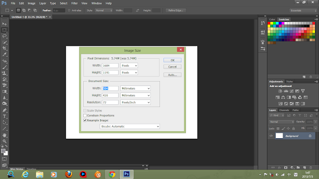
Scan it into the computer and open up drawing in photoshop. Resize picture to A2 (420mm x 594mm) size and resolution of 300 pixels.

Step 2:
Open a new layer to start of the hair, face and body of that two women. I use brush tool to color it. The color which i use is black and orange (the color of our skin). 

Step 3:
Create a new layer to color the clothing of the two women. I use light purple, pink and light blue to color the clothes of the women who is busy working. Then, i use red and dark blue to color the clothes of the another women with same layer.

Step 4:
Usually, the color of robot is silver or grey color. So i use the traditional concept, choose grey color to color the whole body of the robot. But the hand of the robot i use the light blue to color it because of i want the hand of the robot can be more extraordinary to show the handle of the robot and i think blue can represents future. The button at the body of robot, i use red, yellow, green and orange to show that the robot understand what the master called and response it. New layer used for this section.  

Step 5:
I use red, yellow, blue and green to color the file on the table and the one which hold on the hand show that many kind of thing want to do it. Used light blue and dark blue to color the table. Used grey and light blue color the old-fashion computer. Light blue to color the stack of paper. Handphone used green color to fill it and red and orange to color the office phone. The last one, i use dark green and grey to color the board which has some paper stick on it. New layer created for this section.

Step 6:
Most of the color i use of this part is blue such as the chair is blue, laptop is light blue, ipad is light blue, the cup of coffee is blue and the board which has stick some paper on it is dark blue and light blue because of blue represents future in my opinion and this part (the right side)  is shows that the future. The handphone which hold on the hand of robot is black and the switch hold on the women is purple only. A new layer created for it.

Step 7:
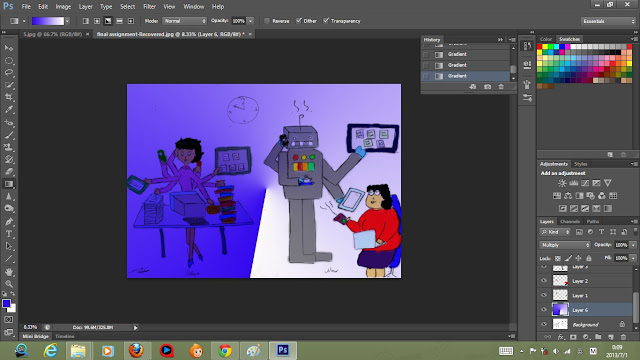
Finally, i use gradient tool (angle gradient) blue and white to color the background. The left side rather dark shows that before the women work until night but haven't finish her work yet, still want to overtime. But now the other side (right side) shows that whether night or morning, the women just sit at there without any moving but can do anything with a high technology (robot). Actually the women inside the picture is same person.
Final Artwork


Artist Statement
Actually the two women is same person but the different is before and now only. The left side shows that the women want to do everything by herself since morning to night but haven't finish yet. This shows that before the risen of high technology, we need to do anything by ourselves but now the improvement of high technology cause most of the thing what we do are depends on it. It has led us to a comfortable life just like the other side (right side), the women just sit at there and use the control to control anything what she want to do without by herself whether morning or night. This represents that a high technology led us to a easier life compare to the time without high technology.



Trip to National Art Gallery

On June 8, 2013, we all went to the National Art Gallery to view some of the art piece by amazing artist from Malaysians. I had seen many kinds of art piece from there. Among of these art piece, i was attracted by a meaningful picture. Actually i don't understand what the meaning of that picture instead but after my friend explain to me what the meaning of that picture. I realized for it finally. In that picture, i can see there has three old man who are squatting at there to see the three pictures which they are inside and one old man had died already. One of the pictures what they seen show that the three old man are all inside and thinking for something troubles with the face of painful and one is died already. The second and third pictures is same with the first picture, thinking for something like thinking for their past but actually i not really understand what the meaning of the two pictures. In conclusion, what i see from that picture is the three old man squatting at a small house seen their past, thinking for their past with a painful emotions and one is died, lying at there has some time already. But nobody ignore them. But i got some confused is why there has some person standing at the outside of the small house looks like they are visiting the house and looking the situation inside the small house where has the four old man with a curious emotions. I feel that this is a meaningful and profound picture attract me to see more times for it whether i not really understand for it.
I enjoy this trip to National Art Gallery with my friends and lecture because this trip make me improve my creative and knowledge a litter.

Pop Art


Summer Beach


Shape


A Meaningful Picture


This picture captured at China where the places happened 6.1 earthquake. This is a very serious scourge cause most of the buildings collapsed. This picture can be seen that one of the house at there landslide and cause a mother and a daughter who are eating buried alive in the earth. This picture shows that the mother and her daughter is eating at the moment when the earthquake struck, the mother used her own body to protect the side of her daughter, and even no times to throw away the chopsticks which hold in her hands. What she had done is only want her daughter can survive in this world but the merciless of the earthquake took the lives of mother and also her daughter. When the fire brigade dig out them from the rubble, they still maintained stiff body posture embraced. At the last moment of death, the mother still protect her daughter. From this picture, i realized that a great love of a mother can be overbear anything even death. The love of a mother is no value and can't be measure. Mother's love is irreplaceable, forever and unconditional. A mother can do anything to their kids even their kids are grown up or they had become father or mother too. But what a mother done is no reply, they didn't hope we can reply them anything, just hope we can gone well our life forever only.

My Favorite Color


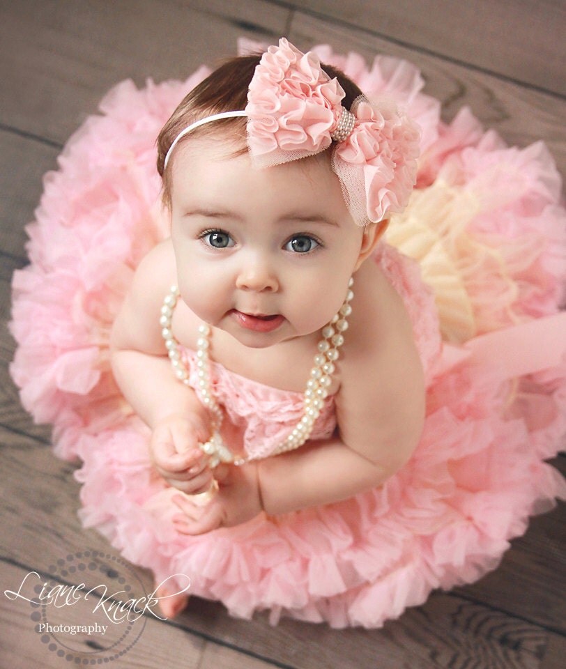
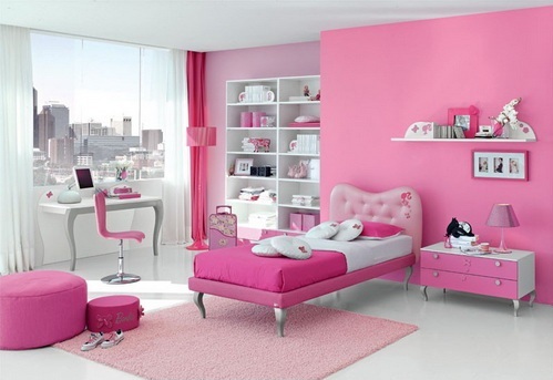
My Favorite Color:Pink


Pink represents:
Unconditional love: Pink relates to both unconditional love and romantic love.
Compassion: Empathy and understanding are the fuel for pink's nurturing.
Nurturing: Pink is both the giving and the receiving of love, understanding and respect.
Hope: Pink inspires the possibility of a positive outcome.
 
Effects of the Color Pink:
Calming: Pink calms our emotional energies.
Non-threatening: Pink lacks any aggression or anger, although the deeper pinks can be more assertive and confident.
Affectionate: Pink offers warmth and tenderness to friends and family.
Caring: Sensitivity and tender loving care relate to pink's feminine and intuitive energies.
Immature: Pink is the color of the sweet young girl, before life's experiences take over.
             
My opinion:
I choose pink color for my favorite color because of this color make me feel comfortable, calming, and caring. When i feel helpless, it will make me feel that all my family and those person who are caring me are around me and encourage me don't give up. Besides that, this color can calms my emotion when i feel vexed to some troubled thing. In addition,pink is a sign of hope in color psychology. It is a positive color inspiring warm and comforting feelings, a sense that everything will be okay. It is a non-threatening color seeking appreciation, respect and admiration. It doesn't like to be taken for granted and just loves to hear the words 'thank you'.It can be signify good health, being 'in the pink', and success as in 'everything's rosy'.I love pink color since i was a child and i think i will love this color forever because of it bring a lot of benefit to me.


Wednesday, 3 July 2013

Design elements and principles

Design elements and principle
Design elements can divided into 9 parts: line, shape, uses, attributes, texture, color, categories, space and form.

  • Line:
Line can be considered in two ways. The linear marks made with a pen or brush or the edge created when

two shapes meet.


  • Shape:
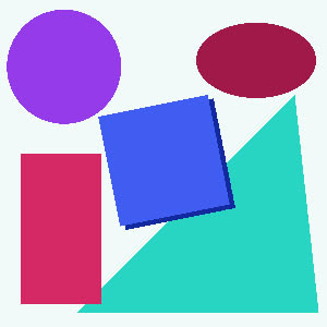
A shape is defined as an area that stands out from the space next to or around it due to a defined or implied boundary, or because of differences of value, color, or texture. All objects are composed of shapes and all other 'Elements of Design' are shapes in some way.
         

  • Uses:

  1. A line that defines or bounds an edge, but not always the outside edge, could represent a fold or color change.
  2. A line that defines the edge of space can also be created by a gap of negative space. Many uses include to separate columns, rows of type, or to show a change in document type.
  3. Lines are used in linear shapes and patterns to decorate many different substrates, and can be used to create shadows representing tonal value, called hatching.
  • Attributes:
  1. Hue
  2. Values and tints and shades of colors that are created by adding black to a color for a shade and white for a tint. Creating a tint or shade of a color reduces the saturation.
  3. Saturation gives a color brightness or dullness.
  • Texture:
Texture is the surface quality of a shape - rough, smooth, soft hard glossy etc. Texture can be physical

(tactile) or visual.


  • Color:
Color can play a large role in the elements of design with the color wheel being used as a tool, and color threory providing a body of practical guidance to color mixing and the visual impacts of specific color combination.
  1. Colour can be described as Bold, warm, cool, monotone, complementary, triadic, analogous 
  2. Red can be interpreted as hot, dangerous, exotic
  3. Blue: calm, cool, airy 
                                           
  • Categories:
  1. Mechanical Shapes or Geometric Shapes are the shapes that can be drawn using a ruler or compass. Mechanical shapes, whether simple or complex, produce a feeling of control or order.
  2. Organic Shapes are freehand drawn shapes that are complex and normally found in nature. Organic shapes produce a natural feel.
  • Space:
In design, space is concerned with the area deep within the moment of designated design, the design will take place on. For a two-dimensional design space concerns creating the illusion of a third dimension on a flat surface:
  1. Overlap is the effect where objects appear to be on top of each other. This illusion makes the top element look closer to the observer. There is no way to determine the depth of the space, only the order of closeness.
  2. Shading adds gradation marks to make an object of a two-dimensional surface seem three-dimensional.
  3. Highlight, Transitional Light, Core of the Shadow, Reflected Light, and Cast Shadow give an object a three-dimensional look.
  4. Linear Perspective is the concept relating to how an object seems smaller the farther away it gets.
  5. Atmospheric Perspective is based on how air acts as a filter to change the appearance of distance objects.
                                     
  • Form:

  1. Created by joining shapes to make a three-dimensional object 
  2. Can be either organic or geometric 
  3. Form can be filled but that fill must be a flat fill and not include tone if it is to be considered and analyzed as form 
                   

Design principles can divided into 8 parts: figure-ground, balance, contrast, cropping, hierarchy, scale, proportion and pattern.

  • Figure-ground:
  1. The figure is what you are meant to notice/see
  2. -   This could be an image, or word
  3. -   The ground is where the figure is placed on 
  4. -   It is known as the negative space (the ground) 
  5. -   Strong figure demands attention – is dominant 

  • Balance:
      1. Symmetrical balance
          -There is equal weight of visual information on both sides of a dividing axis
          -Can be symmetrical vertically, horizontally or diagonally
      2. Asymmetrically balanced
           -There is more weight on one side than the other 
   
  • Contrast:

  1. A way of creating tension within a visual communication
  2. Examples: large and small, dark and light, solid and opaque, shiny and matte, soft and hard, narrow and wide, thick and thin 
  3. Contrast helps leads the viewer to information in a planned manner 
  4. It can also convey a message (for example, an old person and a newborn)


  • Cropping:

  1.  By showing part of a total image or word, you are drawn to focus on it encouraged to fill in the missing detail 
  2.  It leaves you wanting more
  • Hierarchy:
  1. Can determine the order in which a viewer sees or reads visual information 
  2. Can be formed using a range of design elements and other design principles 
  3. Contrast, letterform, figure-ground, point and lines help develop a hierarchy of information
           
  • Scale:

  1. Refers to the size of an object 
  2. The object can be scaled up or scaled down 
  3. Can be referred to large vs. small compared to its natural size
         
  • Proportion:
  1. Alters the appearance of an object 
  2. It can be stretched or flattened or elongated or narrowed
                 
  • Pattern:

  1. Repeating of an element to reinforce a message
  2. Ordered patterns create stability while a pattern that has less distinct repetition of parts can create a sense of visual excitement 
  3. Related sequence, pattern repetition
  4. Organic sequence, pattern alternation
   

Sunday, 30 June 2013

Abstract Painting

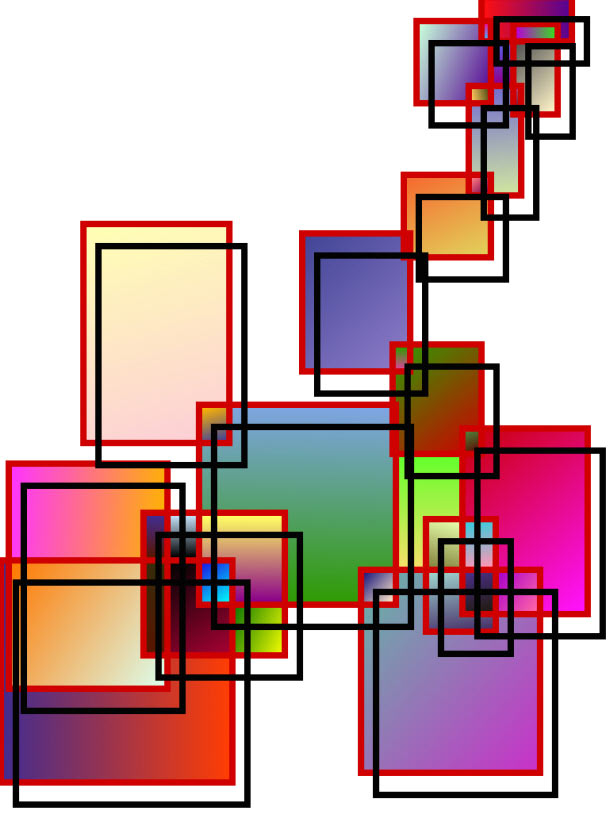
This is my first time do abstract painting.  Actually i don't know how to do it, so i open youtube abstract painting photoshop to learn. But all beautiful one are too difficult to me, so i choose the easy one to do it. I know that what i done is not beautiful, but i really try my best already. I use brush tool to create the leaf shape and then colour it. After that, i use filter and some effect to do it. That's all my step to do this picture. It is easy and simple. Hopefully what i had done is not the bad one.